Research Article - (2015) Volume 3, Issue 3
Keywords: Climate change; Environmental science; Social phenomena
WH. Beveridge, a distinguished British academic, economist, Member of Parliament, Director of the London School of Economics and Political Science and a principal planner of the British welfare state, gathered together many data bearing on wages and prices in England from 1251 to 1914. In this paper, I examine data recently published by Zhang et al. [1] consisting of sixteen data sets lasting between 1500 and 1800 A.D. and in addition another 11 relevant data sets. It is shown that many of the strong correlations between the sixteen data sets claimed by Zhang et al. [1] are in fact not as strong as they claimed. Only one volume of the five planned was published [2] because Beveridge became involved in the war effort and after the war in planning for the old age pension system and the National Health Service (the welfare state). It is ironic that most of the copies of this first volume were destroyed by fire during WWII, but the volume has since been reprinted. Gregory Clark (UC Davis) used data collected by Beveridge and stored in the library of the London School of Economics and Political Science, as well as other data, to continue the analysis started by Beveridge. He has produced a yearly record of prices from 1251 until 1914 [3]. Beveridge wanted to investigate the effect of climate on wages and prices during this time interval but had not arrived at a reasonable climatic series with which to compare his data. He wrote “My own interest in the subject arose not from general considerations but from the belief that the study of prices could be used to throw light upon the problem of periodicity of harvests and so of weather”. With the publication of a major new paper connecting climate, economics, environment, and social behavior by Zhang et al. [1] it is now possible to make some headway at understanding the connections between these phenomena.
Zhang et al. [1] suggest that there are major correlations between various climatic, physical and environmental measurements and some socioeconomic functions during the period from 1500 to 1800 CE. Sixteen different time series were developed and they showed that the correlations between these time series were generally high and also highly statistically significant. The sixteen different time series are described below and were made available as annual data sets by Dr. HF.Lee, the second author of the paper. All had nominally 301 data points.The data sets from Zhang et al. [1] are as follows.
• Northern Hemisphere temperature anomaly. Annual data averaged from 12 individual data sets.
• European temperature anomaly. Two annual temperature records were combined [4,5] by normalizing and then averaging for each year .
• NH extra-tropical tree-ring widths, which may represent bioproductivity. Annual data obtained from Esper et al. [6].
• Grain yield ratio in relation to seed. Data were obtained from Slicher van Bath [7], covering many different European countries for four different grain types. Individual records were interpolated to make up for missing data. Yield ratios for each country and for each grain type were produced and arithmetically averaged to give one data set.
• Agricultural production index. Obtained from population size divided by inflation corrected (CPI index) grain price. These data sets were detrended.
• Average adult height. Various data on femur size were averaged to give a record which had eleven uniform heights of nonuniform duration in years. One duration only lasted for a year, and one lasted for 5 years. The other nine averaged about 33 years duration. Detrended before analysis.
• Grain price. Derived from European commodity price data using four grain types and data from sixteen major European regions. Note the inverse relationship to data set 5. Detrended before analysis.
• Wage index. Combination of two data sets of farm wages (England, by decade and interpolated) and building craftsmen and laborers (19 European cities, annual). Detrended before analysis
• Magnitude of social disturbance. Sorokin’s [8] data set covering Europe defined magnitude using social area of disturbance, duration, size of the masses involved and other things including intensity. This magnitude was divided by its duration. Annual magnitudes of all social disturbances in Europe were summed and then divided by the number of countries in Europe.
• Number of wars. Data obtained from Brecke [9]. 582 wars causing more than 31 deaths were fought in Europe during this time. Each war had a start year and an end year, and the number is just the number of wars in existence.
• War fatality index. Data also obtained from Brecke [9]. There is one sustained period lasting from 1618 to 1648 (the Thirty Years War), and another from 1791 to the end of the record (French revolution and its aftermath) where the fatality index is much higher than during the rest of the time.
• Plagues. Data obtained from Kohn [10] using only European results. The data come every ten years as plagues per decade, and these were linearly interpolated to give 301 data.
• Population growth rate. Established from the yearly differences in the next data set (#14), resulting in eight growth rates. The slopes in this data set are caused by the logarithmic interpolation in Population Size data set.
• Population size. European data were taken from McEvedy and Jones [11]. Population data are at irregular time intervals. Data were logarithmically interpolated. There were nine data points. Detrended before analysis. See data sets #5 and #13.
• Famine. European famines taken from Walford [12]. The original data set was for ten-year periods (31 data). These data were linearly interpolated to give 301 data points.
• Migration. Complex index which comes in 25-year units (13 data), which were linearly interpolated to give 301 data.
An important factor in Zhang et al. [1] is the correlation between the 16 data sets as represented by the 120 correlation coefficients between pairs of data sets. They produced a table of these 120 correlations, and all but four of them are significant at a level smaller than 0.001 (less than 0.1% chance of coming from randomly generated data set pairs). The other four are significant at a level smaller than 0.002. In addition, the correlation coefficients are large, with 86 absolute values greater than 0.5. Before doing the correlations the data were smoothed with a 40 year Butterworth low pass filter. Five data sets were detrended before filtering and correlation, as noted above.
I suggest that the data have been over-interpreted for three reasons. Firstly, the use of a Butterworth filter removes some of the information, implying that 301 should not be used as the number of independent data pairs. Secondly, the linear interpolations which have been done on some data sets do not produce 301 independent results to be used in the correlation analysis, although this number was in fact used to determine the significance of the correlation. Thirdly, detrending the data can result in addition of an important signal in some cases. Each of these will be discussed in more detail in the following sections.
Butterworth filtering
Butterworth filtering the data involves Fourier transforming each data set and multiplying the resulting Fourier coefficients by the following factor.

where ω is the frequency of the coefficient & ω0 is the reference frequency, here 0.025 cpy, and then recreating the signal using the filtered Fourier coefficients. The power (half of the amplitude squared) of a 40 year period (0.025 cpy) is reduced by a factor of 2. I have assumed n to be 1. I subjected the undetrended data to a Butterworth filter and determined the RMS difference between the Butterworth data set and the original data set. I then determined the number of low frequency Fourier spectral estimates that are needed so that the simple low pass filter gives the same RMS difference between the filtered and the unfiltered data as the Butterworth-filtered and unfiltered data. If this number is n then the number of degrees of freedom should be 2n (Table 1).
| 1 | 2 | 3 | 4 | 5 | 6 |
| 1 | NH Temp. | 0.560 | 169 | 169 | 51 |
| 2 | European Temp. | 0.405 | 122 | 122 | 141 |
| 3 | Tree Ring Widths | 0.585 | 176 | 176 | 73 |
| 4 | Grain Yield | 0.804 | 242 | 242 | 25 |
| 5 | Agricultural Production | 0.729 | 219 | 219 | 18 |
| 6 | Height | 0.804 | 242 | 11 | 5 |
| 7 | Grain Price | 0.590 | 178 | 178 | 31 |
| 8 | Wage Index | 0.524 | 158 | 158 | 28 |
| 9 | Social Disturbance | 0.112 | 34 | 34 | 205 |
| 10 | Wars | 0.624 | 188 | 188 | 40 |
| 11 | War Fatalities | 0.522 | 157 | 157 | 19 |
| 12 | Plagues | 0.750 | 226 | 31 | 2 |
| 13 | Population Growth | 0.633 | 191 | 8 | 12 |
| 14 | Population Size | 0.781 | 235 | 9 | 0.007 |
| 15 | Famine | 0.683 | 206 | 31 | 2 |
| 16 | Migration | 0.709 | 213 | 13 | 1 |
Table 1: Degrees of Freedom.
Degrees of freedom
Zhang et al. [1] used 301 as the number of data pairs when they did their correlation analysis on the 120 pairs of data sets. But six of the sixteen data sets did not have 301 data, and simply interpolating between the existing data does not produce any more data, unless it can be clearly proven that the interpolation accurately presents the real variation of the particular data set. For instance data set #6 (Height) consists of the measurements of femur lengths, which were then translated into heights, which were then averaged over eleven non-uniform time periods; there is no reason to believe that the actual average height stayed constant over these time periods, and hence that there are not 301 independent data points in data set 6. One is forced to believe that it is not correct to use 301 as number of data pairs for any data set that did not start with 301 data. Instead it is more correct to use the smaller number when such a data set is being correlated with another data set. If it were legitimate to interpolate between data points, then this could also be done with the yearly data, increasing the number of data points indefinitely, thus rendering all non-zero correlation coefficients statistically significant! Shown in Table 1 of column 5 is the adjustment of degrees of freedom called for by the real number of data in each data set. This affects six of the data sets.
Another consideration concerning degrees of freedom for serial data such as those considered here is that serial correlation implies that the degrees of freedom should be less than the number of data. For instance Slonosky et al. [13] has suggested that the effective number of samples should be reduced using the following formula.
where r1(a) and r1(b) are lag-1 autocorrelation coefficients for each time series, n is the number of data and neff is the corrected number of data to be used in calculating the number of degrees of freedom. If this formula is modified to deal with just one data set then the appropriate formula would be
where r1 is the lag-1 autocorrelation coefficient of the single data set. If this is done, the effective number can drop greatly, as is shown in column 6 of Table 1. This method of dealing with serial correlation does not work in some cases because if one of the lag-1 autocorrelations is negative, this results in an effective number of samples greater than n. For very high values of the lag-1 autocorrelation coefficients, such as with the population size data set, the effective number of data becomes very small. I have not used this method.
Detrending
The problem with detrending some signals is that this automatically adds new strong signals to the data sets. This is illustrated in (Figure 1), which shows two of the data sets that were detrended [1]. The original signal is shown along with the detrended signal. The process of detrending has produced a significant low in each data set in the middle range of age. It turns out that many of the data sets in this paper have either lows or highs in the middle of the age range, which is basically what causes the good correlations found by Zhang et al. [1]. There are five data sets detrended in [1] before analysis. In the analysis to be described below I have not detrended any of the data sets.
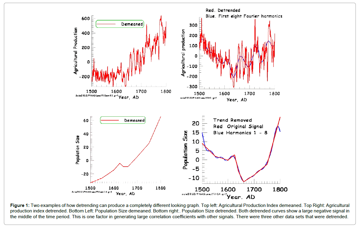
Figure 1: Two examples of how detrending can produce a completely different looking graph. Top left: Agricultural Production Index demeaned. Top Right: Agricultural production index detrended. Bottom Left: Population Size demeaned. Bottom right:. Population Size detrended. Both detrended curves show a large negative signal in the middle of the time period. This is one factor in generating large correlation coefficients with other signals. There were three other data sets that were detrended.
Summary
The large absolute values and the statistical significance of the correlations reported by Zhang et al. [1] are due to three erroneous assumptions. One is that filtering a data set does not remove information. Because filtering does remove information the degrees of freedom to be used when calculating if a correlation coefficient is significant is less than the number of original data. A method of allowing for this has been suggested. This is that the data number should be reduced by the same ratio as the power of the spectrum derived from the filtered profile to the power of the original signal. Secondly, the number of independent observations cannot be increased by linear interpolation unless there is a good argument for doing so. This means that for some data sets the regression coefficients are not as accurate as has been assumed because the number of degrees of freedom should be equal to the number of original data, not to the 301 data produced by interpolation. Thirdly, detrending data may add another variation to the original data set, causing spurious correlations.
To the 16 data sets in [1], I have also considered the following data sets, all given on an annual time scale, and all but one from 1500 to 1800.
1. Clark [3] took the raw data gathered by Beveridge [2] and other data to produce an annual price index for England.
2. Phenology consisting of Swiss grape harvest dates, supposed to be controlled to some extent by the warmth of the summer months, warmer summers causing the grapes to ripen earlier [14].
3. Northern European grape harvest dates (see data set #18) coupled with observations of temperature in England later in the period [15].
4. North Atlantic Oscillation. NAO is the variation in atmospheric pressure difference between Azores and Iceland, which may have an effect on European climate as it controls the westerly winds that predominate in northern Europe [16]. Proxy time series are produced for years prior to the availability of barometers. There is much variation in the various different proxy manifestations of the NAO so that it is difficult to be confident that it represents a real climatic phenomenon (“In fact, prior to the twentieth century, the various NAO index reconstructions published in the literature remain inconsistent with no significant correlations among the different reconstructions” [17].
5. Another phenology paper based on harvest dates for Pinot Noir from Burgundy [18].
6. Atlantic Multidecadal Oscillation, from 1567 [19]. This is a measure of sea surface temperatures in the N. Atlantic Ocean and is calculated prior to the time of actual measurement using proxy indicators. It is only available (in proxy form) since 1567, giving 234 data. It measures North Atlantic sea surface temperature variations, and seems to be correlated to air temperatures and rainfall over much of the Northern Hemisphere.
7. English Price Index [20].
8. Idaho temperatures from tree ring analysis. This is somewhat far away from the European results, but it is interesting to see if there is any connection [21].
9. Phenology based on grapes from France, Switzerland, Alsace and the Rhineland [22].
10. ENSO proxy reconstruction [23,24]. There are so many teleconnections from El Niño Southern Oscillation so it is appropriate to use it here. The El Niño portion refers to changes in low latitude currents in the southern Pacific, with warmer equatorial waters during El Niño and cooler equatorial waters during La Niña. The Southern Oscillation refers to the variation of atmospheric pressure difference between Darwin and Tahiti.
11. Wheat index [25]. This data set was subjected to a form of spectral analysis [26] after having been passed through a high pass filter and the predominant period was 15.25 years, which was claimed to correspond to periods seen in some climate signals.
Because the AMO index is lacking 2/3 of a century of data, it has not been considered further, leaving 26 data sets. Correlation coefficients have been calculated for all 325 pairs of data sets without using any filter and without detrending any of the data sets. I have used a method of data selection which requires the correlation coefficients to be both significantly different from 0 and also I require them to explain at least 5% of the variance, meaning that the absolute value of the correlation coefficient has to be greater than 0.2236 (=√0.05). In order to check for correlation coefficients that are significantly different from 0 I used a transformation given by Fisher [26] in which the transformed correlation coefficient is related to the correlation coefficient by the following equation,

where z is the Fisher transformed coefficient and r is the correlation coefficient. z is approximately normally distributed with a standard error only dependent on the number of pairs of data and given by

where σz is the standard error of z and n is the number of pairs of data. This contrasts with r which is not normally distributed, especially when |r| gets close to 1; the standard error for r depends on the true but unknown value of the population coefficient ρ. If z is divided by 2σz then values of this quantity less than 1 will signify that the correlation coefficient is not statistically different from 0 at the 2.5% level. This number will be called f. The number of data for each data set is 301 apart from the six data sets given in Table 1 (in bold), which have smaller numbers as indicated there. When a correlation is done with two data sets with different numbers of data, the number to be used in the calculation of the standard error of z is the smaller of the two numbers.
These calculations show that 264 data pairs passed the barrier of explaining at least 5% of the variance. 226 data pairs passed the barrier of being significantly different from zero. This adds to 490 positive results out of a total of 1300 [2,26,27] or less than 38%. A total of 174 data set pairs passed both tests out of a possible 750 or just over 23% (Table 2). This is in distinct contrast to the results obtained by Zhang et al. [1], because all 240 of their data set pairs had correlation coefficients significantly different from zero by a large margin.
| 1 | 2 | 3 | 4 | 5 | 6 | 7 | 8 |
| 21 | 1 | NH Temps. | 301 | 13 | 14 | 9 | 27 |
| 2 | 2 | European Temps. | 301 | 15 | 14 | 12 | 29 |
| 3 | 3 | NH Tree Ring Widths | 301 | 14 | 14 | 12 | 28 |
| 20 | 4 | NAO | 301 | 0 | 2 | 0 | 2 |
| 24 | 5 | Idaho Temp. | 301 | 3 | 8 | 3 | 11 |
| 26 | 6 | ENSO | 301 | 0 | 3 | 0 | 3 |
| 18 | 7 | Swiss Wine | 301 | 9 | 10 | 8 | 19 |
| 19 | 7 | Engl. Temp. plus Wine | 301 | 4 | 10 | 3 | 14 |
| 21 | 7 | Pinot Noir Wine | 301 | 2 | 5 | 2 | 7 |
| 25 | 7 | European Wine | 301 | 0 | 1 | 0 | 1 |
| 4 | 8 | Grain Yield | 301 | 14 | 15 | 12 | 29 |
| 5 | 9 | Agric. Prod. | 301 | 14 | 12 | 10 | 26 |
| 6 | 10 | Height | 11 | 15 | 3 | 3 | 18 |
| 8 | 11 | Wage Index | 301 | 13 | 14 | 11 | 27 |
| 9 | 12 | Social Dist. | 301 | 3 | 0 | 0 | 3 |
| 10 | 13 | Wars | 301 | 14 | 13 | 10 | 27 |
| 11 | 14 | War Fatalities | 301 | 15 | 12 | 12 | 27 |
| 12 | 15 | Plagues | 31 | 12 | 8 | 8 | 20 |
| 14 | 16 | Population Size | 9 | 13 | 4 | 4 | 17 |
| 15 | 17 | Famines | 30 | 13 | 9 | 9 | 22 |
| 16 | 18 | Migrations | 13 | 13 | 1 | 1 | 14 |
| 7 | 19 | Grain Prices | 301 | 16 | 16 | 13 | 32 |
| 17 | 19 | Beveridge/Clark Prices | 301 | 12 | 14 | 11 | 26 |
| 23 | 19 | Phelps Brown/Hopkins | 301 | 13 | 12 | 11 | 25 |
| 27 | 19 | Beveridge Wheat Prices | 301 | 12 | 12 | 10 | 24 |
| 13 | 20 | Population Growth | 8 | 12 | 0 | 0 | 12 |
| Totals | 264 | 226 | 174 | 490 |
Table 2: Summary of Correlations between 20 data sets.
As a means of investigating further the connection between external and internal data sets, I used multiple correlation analysis. I decided to see how much the various external (climatic) parameters affected the internal (social) parameters. In order to aid in understanding the results of these multiple correlation coefficients, I demeaned all the data sets and then divided by their standard deviations. The result is that in the normal equation for multiple correlation coefficients given here,
the value of a became zero and the values of the slopes bi showed the relative importance of the independent data sets x1, x2 etc., on the value of the dependent data set y. Also, when doing two parameter (i.e., y and only one x) correlations, the slope b will be the same as the correlation coefficient. The results of the multiple correlation analysis are given in (Table 3).
| Indep. Data Sets | 1 | 2 | 3 | 5 | 6 | 7 | Correlation Coefficient | |
|---|---|---|---|---|---|---|---|---|
| Dep. Data Sets | NH Temp | Eur Temp | Tree Ring | Idaho T. | ENSO | 4 Wine | ||
| 8 | Grain Yield | 0.191/2.42 | 0.212/3.69 | 0.219/2.87 | 0.154/3.09 | .599/.595 | ||
| 9 | Agric. Prod. | 0.548/6.89 | 0.340/5.61 | -0.397/5.28 | 0.447/5.90 | .571/.567 | ||
| 11 | Wage Index | -0.401/4.80 | 0.144/2.26 | 0.635/8.06 | 0.245/3.08 | .507/.502 | ||
| 13 | Wars | -0.241/3.86 | -0.302/4.69 | 0.285/3.54 | .472/.472 | |||
| 14 | War Fatal. | 0.300/3.53 | -0.175/2.80 | -0.525/6.32 | 0.115/2.11 | .477/.477 | ||
| 15 | Plagues | -0.461/2.64 | .535/.461 | |||||
| 17 | Famines | -0.518/3.305 | .580/.518 | |||||
| 19 | 4 Prices | 0.342/6.41 | -0.529/10.07 | 0.241/7.10 | -0.222/4.33 | .636/.544 | ||
Table 3: Multiple Correlation Analysis Between 8 Dependent Data Sets and 6 Independent Data Sets.
In order to simplify the analysis I decided to combine all four price indices (data sets #7, #17, #23 and #27) by simple averaging and count this as a social, dependent data set. It is illustrated in (Figure 2). I also combined the four phenology data sets (data sets #18, #19, #21, and #25) into a single independent data set by averaging the four data sets. This may indicate temperature change during the summer months, and so is an external data set. These data are illustrated in (Figure 3).
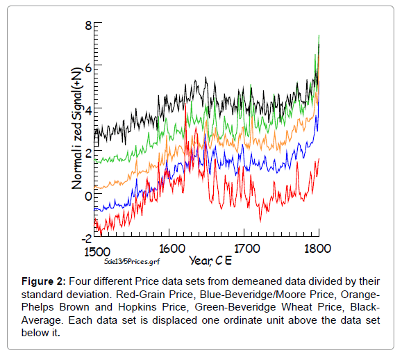
Figure 2: Four different Price data sets from demeaned data divided by their standard deviation. Red-Grain Price, Blue-Beveridge/Moore Price, Orange- Phelps Brown and Hopkins Price, Green-Beveridge Wheat Price, Black- Average. Each data set is displaced one ordinate unit above the data set below it.
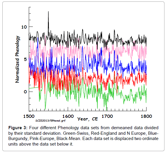
Figure 3: Four different Phenology data sets from demeaned data divided by their standard deviation. Green-Swiss, Red-England and N Europe, Blue- Burgundy, Pink-Europe, Black-Mean. Each data set is displaced two ordinate units above the data set below it.
Since I did not use the AMO data set because of its limitation of extension to 1500 CE, I ended up with 20 data sets. These were renumbered with seven independent data sets (NH Temp., European Temp., Tree Ring Widths, NAO, Idaho Temperatures, ENSO and Wine Phenology) being given the numbers 1 to 7. The new numbering system is given in (Table 2).
The Social Disturbances data set (#12) had one correlation with Northern Hemisphere Temperature (#1). However the correlation coefficient, although significantly different from zero, was only -0.146, representing less than 2.2 % of the variance. On doing a correlation with each other external data set as well as data set #1, no other data set had a slope statistically different from zero. On doing a multiple correlation with all seven independent data sets the correlation coefficient only went up to 0.175 representing 3% of the variance. So the Social Disturbances data set will not be considered further.
Table 3 gives the results of these multiple correlations. The Plagues data set (#15) is correlated with the European Temperature data set (#2) with a correlation coefficient of -0.461, which is 2.65 times its standard error (using n=31) and so is significantly different from zero. On adding other data sets none was found that had a slope significantly different from zero. Nevertheless, since the correlation coefficient is of reasonable size, it has been put in Table 3, even though it is not a “multiple” correlation.
The Famines data set (#17) is correlated with the NH Tree Ring Width data set with a correlation coefficient of -0.518. If other external data sets are added serially one by one none of them achieves a slope significantly different from zero. The ratio of the correlation coefficient (or slope) to its standard error is 3.305. So this is a strong and significant correlation and has been put into Table 3, with the same caveat as for data set #15.
The method of multiple linear correlation consisted of taking each dependent data set and doing a multiple correlation with all seven of the external independent data sets. This gives the values of the seven bs, plus their standard errors, as well as the correlation coefficient, whose squared value represents the proportion of variance explained by the multiple correlation. If a b value for a specific external data set was less than twice its standard error, then that independent data set was considered to have too uncertain a contribution to the explanation of the dependent data set to worry about and another run was made with only those independent data sets left whose slopes were greater than twice their standard errors. It was found that the NAO independent data set (number 4 in the new numbering) never achieved a slope greater than twice its standard error. Thus there were only six independent data sets to be considered.
There were also five dependent data sets that did not have significant correlation with any independent data set to achieve the goal of having the slope be greater than twice its standard error. All of the six data sets that were not considered further are identified in Table 2 as bolded lines. Four of these six data sets had far fewer than 301 independent data and so this increased the standard error which was calculated for any correlation by the factor √{298/(n-3)} where n is the number of data in the data set. This factor can be larger than 7. These four data sets had the smallest number of data, all less than 14.
So we are left with six independent data sets and eight dependent data sets. The results for the relationship between the dependent data sets and the independent data sets are given in Table 3. In the last column, the first number is the correlation coefficient when all seven independent data sets are used (including the NAO data set), and the second number is when only the ones with slopes significantly different from zero are used. These two numbers are very close, two cells having almost the same values. This illustrates that the independent data that were removed had little influence on the ability to reduce the overall variance.
In the boxes showing correlations between independent (horizontal) and dependent (vertical) data sets the left hand number is the value of the slope bj for the independent variable listed at the top of the table. The right hand number is the ratio of this to the standard error of bj. This ratio is always greater than 2, by choice. It can be seen that the Northern Hemisphere Temperature record, the European Temperature record and the Tree Ring record have strong correlations to six of the eight dependent variables left after the winnowing process. The phenology data set contributed significantly to four of the data sets, the Idaho Temperature record was important in two dependent data set correlations and the ENSO data set was strongly correlated with just one dependent data set. The strength of the correlations with the Extra Tropical Tree Ring Widths was considerably greater than for the other five data sets. This is shown by the bolded numbers in Table 3, indicating the independent data set with the largest slope, of which five out of eight are for the extra-tropical tree ring width data set. The average absolute slope for the Tree Ring Width data set was 0.471, that for the NH Temperature was 0.337, that for the European temperature was 0.272. As might be expected, the correlation between the two numbers in each cell of the central part of Table 3 is high. As regards the dependent data sets, five of them had significant correlations with four independent data sets, one with three independent data sets and two with one independent data set (as pointed out above).
In order to illustrate some of these correlations (Figure 4) shows the Grain Yield index plotted against the four independent variables correlated with it. This does not bring out the strength of the correlations as well as (Figure 5), which shows the correlation between Extra Tropical Tree Ring Widths and Grain Yield. Figures 6-9, show plots of four of the eight dependent variables and the independent variable that gives the highest correlation with the dependent variable under consideration, as a function of time. Others are shown in the supplemental information (Figures 10-13). The correlations can easily be seen by eye in these sequential plots.
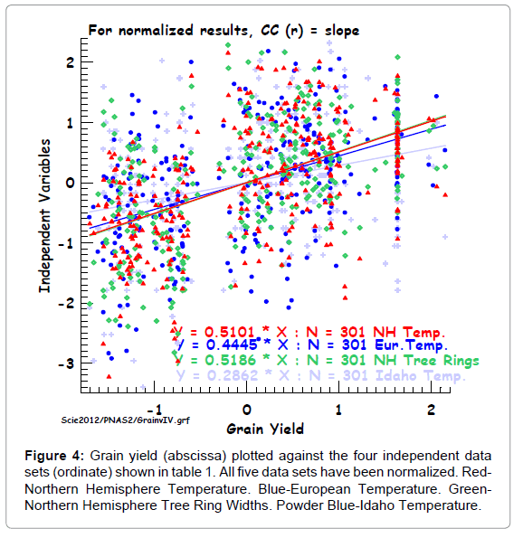
Figure 4: Grain yield (abscissa) plotted against the four independent data sets (ordinate) shown in table 1. All five data sets have been normalized. Red- Northern Hemisphere Temperature. Blue-European Temperature. Green- Northern Hemisphere Tree Ring Widths. Powder Blue-Idaho Temperature.
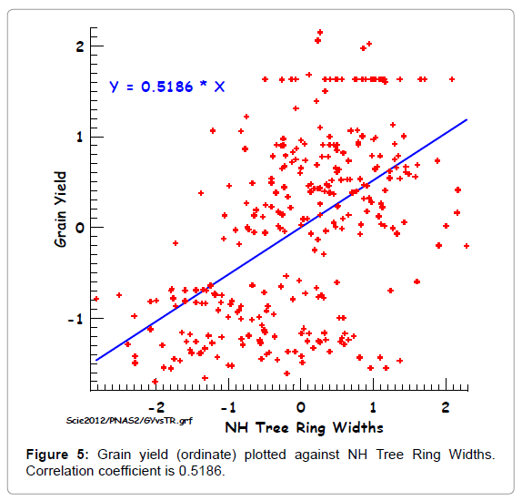
Figure 5: Grain yield (ordinate) plotted against NH Tree Ring Widths. Correlation coefficient is 0.5186.
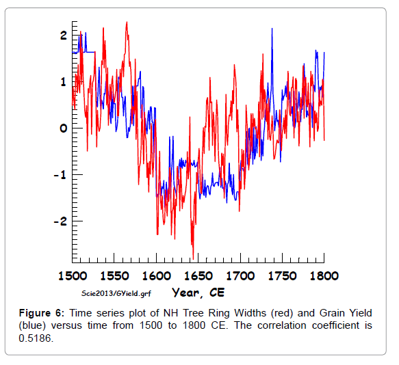
Figure 6: Time series plot of NH Tree Ring Widths (red) and Grain Yield (blue) versus time from 1500 to 1800 CE. The correlation coefficient is 0.5186.
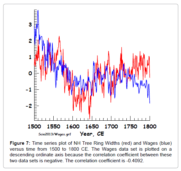
Figure 7: Time series plot of NH Tree Ring Widths (red) and Wages (blue) versus time from 1500 to 1800 CE. The Wages data set is plotted on a descending ordinate axis because the correlation coefficient between these two data sets is negative. The correlation coefficient is -0.4092.
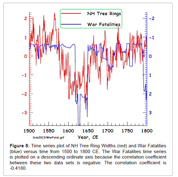
Figure 8: Time series plot of NH Tree Ring Widths (red) and War Fatalities (blue) versus time from 1500 to 1800 CE. The War Fatalities time series is plotted on a descending ordinate axis because the correlation coefficient between these two data sets is negative. The correlation coefficient is -0.4180.
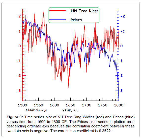
Figure 9: Time series plot of NH Tree Ring Widths (red) and Prices (blue) versus time from 1500 to 1800 CE. The Prices time series is plotted on a descending ordinate axis because the correlation coefficient between these two data sets is negative. The correlation coefficient is-0.3622.
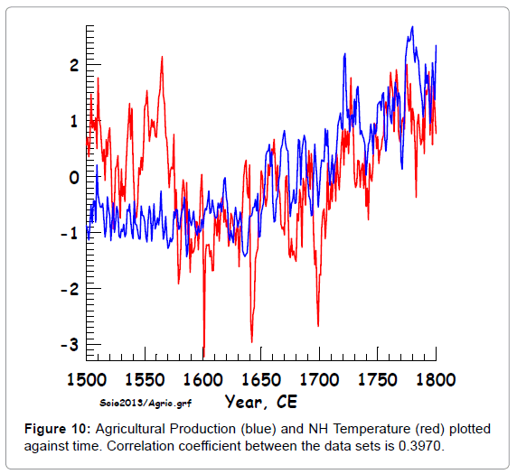
Figure 10: Agricultural Production (blue) and NH Temperature (red) plotted against time. Correlation coefficient between the data sets is 0.3970.
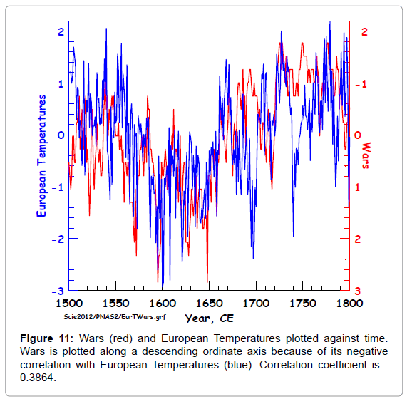
Figure 11: Wars (red) and European Temperatures plotted against time. Wars is plotted along a descending ordinate axis because of its negative correlation with European Temperatures (blue). Correlation coefficient is - 0.3864.
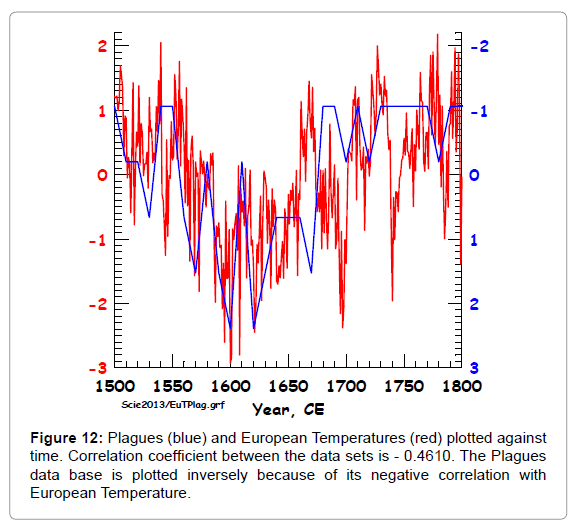
Figure 12: Plagues (blue) and European Temperatures (red) plotted against time. Correlation coefficient between the data sets is - 0.4610. The Plagues data base is plotted inversely because of its negative correlation with European Temperature.
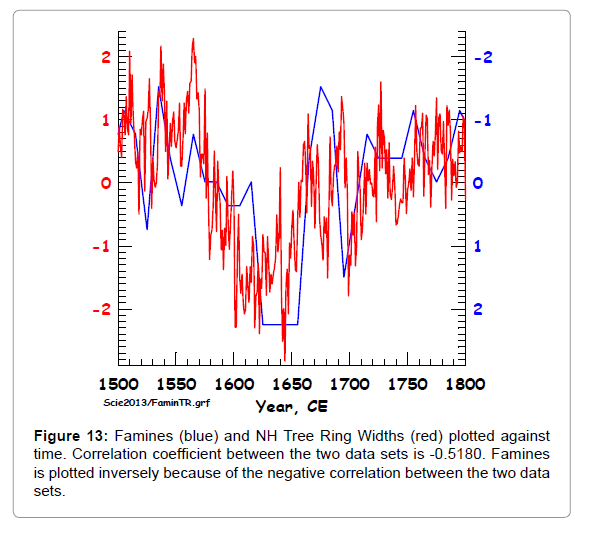
Figure 13: Famines (blue) and NH Tree Ring Widths (red) plotted against time. Correlation coefficient between the two data sets is -0.5180. Famines is plotted inversely because of the negative correlation between the two data sets.
We started off with 27 data sets. Eleven could be classified as external (having to do with climate or external forces of nature, including climate proxies such as the four wine phenology data sets) and sixteen could be classified as social (including four price data sets). The four phenology data sets were averaged and the four price data sets were averaged, and the AMO index was removed from further consideration because it started late in the sixteenth century. This reduced the number of external data sets to seven and the number of social data sets to thirteen.
Multiple linear correlations were done between each (dependent) social data set and the seven (independent) external data sets. All four of the 13 dependent (social) data sets in paper (1) with the smallest number of original data were not correlated significantly with any of the seven independent (external) data sets. One additional data set with 301 data (social disturbance) also fell into this category. After removal of these data sets there were eight dependent data sets remaining. All of these data sets had strong correlations with one or more of the external data sets (Table 3), but one of the external data sets did not appear in the list of correlations. So the final set of correlations was between eight dependent (social) data sets and five independent (external) data sets. Hopefully, other social and physical data sets during the time period under consideration (1500-1800) can be constructed to determine if there are any other valid correlations. It would also be useful to expand this into later periods although allowance would have to be made for the effect of humans on climate.
As regards the way in which the independent data sets and the dependent data sets are correlated Table 3 shows the following. On the assumption that larger tree ring widths are also showing higher temperatures, then the eight bolded numbers in Table 3 show the following. Grain Yield, Agricultural Production, and Wages are all positively correlated with a Temperature index. Wars, War Fatalities, Plagues, Famines, and Prices are negatively correlated with a Temperature index. A simple conclusion is that positive aspects of human activity in Europe are correlated with high temperatures whereas the negative aspects of human activity are correlated with low temperature. Higher temperatures are better for humanity in Europe during this time interval apart from those people producing goods, as the price index is reduced during times of higher temperature. The simple correlation coefficients shown in Figures 6-13 correspond in sign to the partial correlation coefficients shown as the left hand number in the columns of cells in Table 3 referring to the six independent variables (1-3 and 5-7).
The original sixteen data sets in Zhang et al. [1] were over interpreted due to (a) Butterworth filtering, (b) detrending five data sets produced spurious signals and correlations, and (c) six data sets had far fewer than the nominal 301 data that were used to estimate correlation significance. In addition to the 16 data sets, another 11 data sets were added. These data sets were divided into two groups, one group representing external variables having to do with weather or climate, and classified as independent variables, and one group representing internal variables of human activity, and classified as dependent variables. After combining four price indices, and four wine phenology indices and other adjustments, six independent variables and eight dependent variables were left and were subjected to multiple linear correlation. The independent data sets had to do with climate and were Northern Hemisphere Temperature, European Temperature, Northern Hemisphere Extra Tropical Tree Ring Widths, Idaho Temperature, the ENSO index, and Wine Phenology as a measure of European summer temperatures. The dependent variables having to do with social phenomena were Grain Yield (significantly correlated with four independent data sets), Agricultural Production (four), Wage Index (four), Wars (three), War Fatalities (four), Plagues (one), Famines (one), and Price Data (four). Northern Hemisphere Temperature was significantly correlated with six dependent data sets, European Temperature (with six), Tree Ring Widths (six), Idaho temperatures (two), ENSO (one), and Wine Phenology (four). The independent variable Tree Ring Widths was the most important independent variable both from the point of view of the total absolute slopes (2.437, the next highest being 2.17 from the NH Temperature index) and also as an average (0.487, the next highest being 0.362 also from the NH Temperature index). For this limited set of data there were strong correlations between external data sets (those related to climatic measurements) and some of the internal data sets (involving human activity), indicating that some (but not all) of the conclusions arrived at by Zhang et al. (1) were justified. Finally, warmer temperatures seem to benefit Europeans in several aspects such as greater grain yields (positive correlation) and fewer wars and war fatalities (negative correlations).
I thank Dr. H. F. Lee for sending the sixteen data sets soon after publication of their interesting paper. I also thank Dr. G. Clark for sending me his prepublication data set on English prices, which helped to get me interested in the connection between weather, climate and social phenomena.